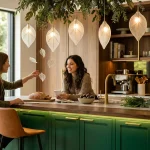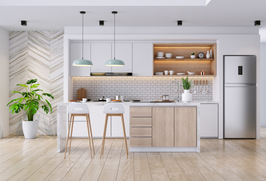
Light green has emerged as one of the most versatile and sophisticated choices for kitchen remodeling, offering homeowners a refreshing departure from conventional neutrals while maintaining the timeless elegance that endures through design trends. Whether you're drawn to soft sage, pale celadon, or gentle mint undertones, light green palettes create spaces that feel both calming and intentional—qualities that matter deeply when designing a room where families gather and memories form. The beauty of this color family lies in its remarkable adaptability: it complements virtually every cabinet style, from traditional raised-panel doors to sleek contemporary flat-front designs, and performs exceptionally well across different lighting conditions, from north-facing kitchens that need brightness to south-facing rooms where it adds subtle depth.
Quick Answer: The best light green kitchen colors depend on your cabinet style and natural light. For traditional cabinets, consider soft sage or muted eucalyptus tones that pair beautifully with warm wood accents; for modern kitchens, pale celadon or barely-there pistachio creates a clean, contemporary feel. In rooms with limited natural light, choose warmer greens with subtle yellow undertones, while bright south-facing kitchens can handle cooler, more saturated greens without feeling overwhelming.
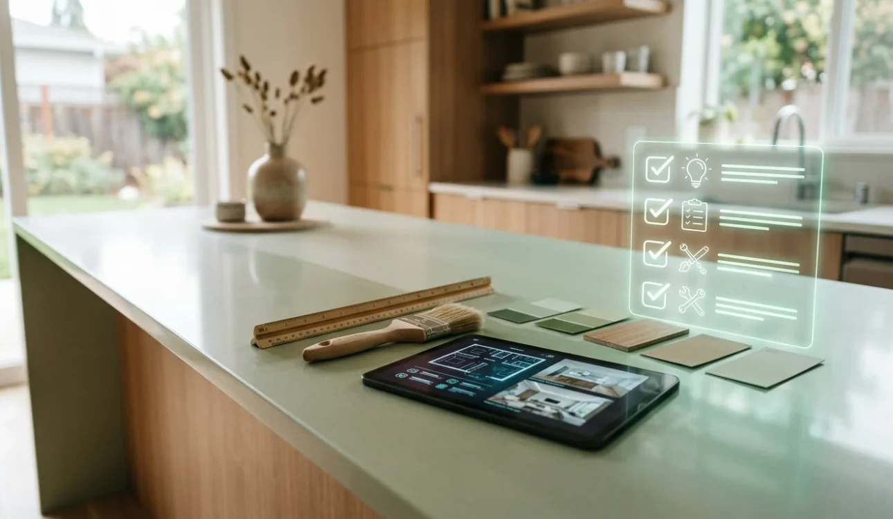
This comprehensive guide walks you through selecting the perfect light green shade for your kitchen remodel, from understanding how different paint brands deliver color consistency to evaluating how your space's orientation and existing materials influence your final choice. You'll discover practical strategies for coordinating light green with countertops, backsplashes, and hardware, learn which application methods ensure professional results, and explore how thoughtful color selection creates kitchens that feel larger, more welcoming, and genuinely reflective of your home's character. Whether you're working with a designer or managing your remodel independently through solutions like those offered at WAREMODEL—which specializes in creating efficient, beautiful spaces—the insights here will help you make confident decisions that transform your kitchen into a retreat you'll love for years to come.
Table of Contents
- Understanding Light Green Undertones and How They Work in Kitchens
- Top Paint Brands and Light Green Colors for Kitchen Cabinets
- Step-by-Step Process for Selecting Your Light Green Kitchen Color
- Pairing Light Green Kitchen Colors with Walls and Trim
- Hardware and Fixture Finishes That Complement Light Green Cabinets
- Preparation and Application Tips for Light Green Kitchen Cabinet Paint
- Prerequisites and Planning
- Step-by-Step Cabinet Preparation Process
- Choosing Your Finish: Matte, Satin, or Semi-Gloss
- Professional Application vs. DIY Execution
- Timeline Expectations and Drying Protocols
- Common Mistakes to Avoid When Choosing Light Green for Kitchens
- Frequently Asked Questions About Light Green Kitchen Colors
- Creating Your Perfect Light Green Kitchen Through Thoughtful Color Selection
Understanding Light Green Undertones and How They Work in Kitchens
Light green exists on a spectrum far more complex than a simple paint chip suggests. The undertone—the subtle color that sits beneath the primary hue—fundamentally determines how a light green will perform in your kitchen. Understanding these undertones is essential because the same paint name from two different manufacturers can read entirely differently depending on whether blue, yellow, or neutral pigments dominate the formula.
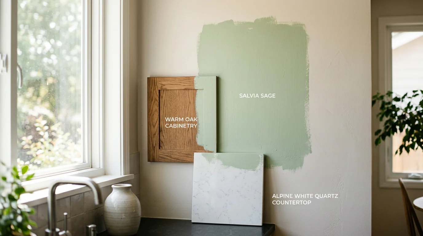
There are three primary undertone categories to consider. Cool-toned greens contain blue or gray undertones, creating a serene, almost ethereal quality that feels contemporary and sophisticated. These work beautifully in modern kitchens and pair elegantly with stainless steel appliances, white subway tile backsplashes, and cool-gray countertops. Warm-toned greens lean toward yellow or olive undertones, delivering a softer, more organic feel that connects to nature and creates coziness. These harmonize exceptionally well with warm wood cabinets, cream-colored countertops, and brass or bronze hardware. Neutral greens sit in the middle ground, containing balanced pigmentation that adapts more flexibly to surrounding elements—though they require careful coordination to avoid appearing washed out or indecisive.
Your kitchen's lighting conditions dramatically influence how undertones express themselves. Natural light from north-facing windows tends to emphasize cool undertones and can make warm greens appear slightly muted, while south-facing kitchens flooded with warm sunlight will amplify yellow undertones and can intensify cool greens to the point of feeling sterile. Artificial lighting adds another layer: warm LED bulbs (2700K) will enhance yellow-olive greens, whereas cool white bulbs (4000K+) will strengthen blue-gray undertones. Existing cabinet materials and countertop colors act as a secondary filter, reflecting light back onto your walls and either reinforcing or contradicting the green's undertone.
The most critical step before committing to any light green is testing it in your actual kitchen space. Paint large sample swatches—at least 2-by-3 feet—directly onto your walls in multiple locations: near windows, under artificial lighting, and in shadowed corners. Observe the color at different times of day, from morning through evening, because undertones shift subtly as light quality changes. If you're coordinating with existing materials like countertops or backsplashes, place your sample swatches directly adjacent to them to verify harmony. This real-world testing reveals whether a cool-toned celadon will clash with warm oak cabinetry, or whether a soft olive-green will recede too far into the background under your kitchen's specific lighting conditions—insights no showroom sample can provide.
Top Paint Brands and Light Green Colors for Kitchen Cabinets
Selecting the right paint brand and specific color is where abstract preference becomes tangible reality. The three dominant players in premium kitchen cabinet paint—Benjamin Moore, Sherwin-Williams, and Farrow & Ball—each offer distinct formulations, color palettes, and finishes that cater to different aesthetic goals and lighting scenarios. Rather than treating these brands as interchangeable, understanding their undertone profiles and application characteristics allows you to match the precise green to your kitchen's architecture and design intent.
| Color Name | Brand | Undertone Profile | Best Use Case | Finish Type |
|---|---|---|---|---|
| October Mist (1495) | Benjamin Moore | Warm yellow + gray balance | Versatile across lighting; works with warm wood cabinets and neutral countertops | Advance (semi-gloss) |
| Evergreen Fog (SW 9130) | Sherwin-Williams | Cool gray-green | Modern, minimalist kitchens; pairs well with stainless steel and light marble | ProClassic (semi-gloss) |
| Sea Salt (SW 6204) | Sherwin-Williams | Subtle green-gray, airy | Light, transitional spaces; recedes into background without feeling cold | ProClassic (semi-gloss) |
| French Gray (No. 18) | Farrow & Ball | Cool blue-gray-green | Designer-preferred choice; shifts throughout day; complements period and contemporary aesthetics | Estate Eggshell (mid-sheen) |
| Calke Green (No. 34) | Farrow & Ball | Muted olive-green with depth | Sophisticated, layered kitchens; anchors bold backsplashes without overwhelming | Estate Eggshell (mid-sheen) |
| Healing Aloe (2036-50) | Benjamin Moore | Soft yellow-green, warm | Open-concept kitchens; creates approachable, welcoming atmosphere | Advance (semi-gloss) |
Benjamin Moore's October Mist remains a steadfast choice among remodeling professionals because its balanced undertone—neither leaning aggressively warm nor cold—performs reliably across variable lighting conditions. The Advance line delivers exceptional durability for high-traffic cabinet surfaces, though it requires proper surface preparation and application technique.
Sherwin-Williams excels at offering nuanced gray-green options that feel contemporary without sacrificing warmth. Evergreen Fog delivers the "fog" quality literally—a soft diffusion that prevents the color from feeling saturated or demanding. Their ProClassic formula, while requiring longer dry times between coats, produces a hard, moisture-resistant finish ideal for kitchens where steam and splashing occur daily.
Farrow & Ball's paint, sourced from the UK and formulated to their exacting standards, carries a premium price point but justifies it through exceptional pigment quality and the brand's reputation among interior designers. French Gray, according to design publications, stands as the most recommended light green for kitchen cabinetry because it genuinely shifts undertone throughout the day—appearing cooler in morning north light and warmer under evening incandescent bulbs. This tonal fluidity creates visual interest and prevents the monotony of a static, unchanging color.
When planning a kitchen remodel that emphasizes both aesthetic refinement and functional durability, the finish type matters as much as the color itself. Semi-gloss finishes from Benjamin Moore and Sherwin-Williams offer superior moisture and stain resistance, essential for cabinet surfaces exposed to cooking humidity and occasional splashing. Farrow & Ball's Estate Eggshell provides a more muted sheen—softer to the eye, though slightly less protective—making it preferable if you prioritize a sophisticated, less-reflective appearance over maximum durability.
The undertone you select should reference your existing kitchen materials. Warm-leaning greens like October Mist and Healing Aloe harmonize with natural wood tones and warm countertops (granite with amber flecks, warm quartz). Cool-leaning options like French Gray and Evergreen Fog integrate seamlessly with stainless steel appliances, cool-toned countertops, and contemporary hardware finishes. Always request sample pints and test each color on your actual cabinet doors or sample panels in your kitchen's lighting before committing to a full project.
Step-by-Step Process for Selecting Your Light Green Kitchen Color
Selecting the right light green shade for your kitchen requires a methodical approach that moves beyond aesthetic preference alone. The process demands attention to your home's existing conditions, lighting patterns, and material palette. By following these deliberate steps, you'll narrow down thousands of possible options to the one shade that genuinely works for your space.
1. Assess Your Kitchen's Natural and Artificial Lighting
Begin by observing how light moves through your kitchen at different times of day. North-facing kitchens receive cool, consistent light that can make warm greens appear slightly muted, while south-facing spaces get intense, warm sunlight that can intensify undertones. Spend a full day noting when your kitchen feels brightest and dimmest. Artificial lighting matters equally—overhead recessed lights, pendant fixtures, and under-cabinet LED strips all cast different color temperatures. Cool-white LED bulbs (4000K or higher) will emphasize blue undertones in your chosen green, while warm-white bulbs (2700K) will enhance yellow and amber notes. This foundational step prevents the frustration of selecting a color in the paint store only to discover it looks entirely different at home.
2. Gather Paint Samples From Multiple Manufacturers
Request sample pints of at least five to seven light green options from reputable brands. Don't rely on a single manufacturer—Benjamin Moore, Sherwin-Williams, and Farrow & Ball each formulate colors with distinct pigment ratios, meaning the same visual description can produce subtly different results. Ask specifically for colors marketed as "soft sage," "pale celadon," "muted pistachio," or similar descriptors that suggest light green cabinet colors with depth rather than nursery-room pastels. When choosing kitchen colors for cabinetry, sample diversity protects you from commitment to a shade that doesn't align with your vision once applied to actual surfaces.
3. Test Colors on Cabinet Doors or Large Sample Panels
Paint substantial areas—ideally full cabinet doors or poster-board panels at least 2 feet by 3 feet. Small paint chips are deceptive; they don't show how color behaves across larger surfaces or how it interacts with adjacent materials. Position your test panels directly on the cabinets you plan to paint, or mount them where they'll receive the same light exposure. Leave them visible for 48 to 72 hours, observing them in morning, afternoon, and evening light. This extended viewing period reveals whether a color maintains its appeal or begins to feel too yellow, too gray, or too blue as lighting conditions shift.
4. Cross-Reference With Countertops, Flooring, and Hardware
Light green doesn't exist in isolation—it must harmonize with your countertop material, floor color, and cabinet hardware. Pull samples of your chosen granite, quartz, wood, or tile and place them directly adjacent to your painted test panels. Stainless steel hardware and appliances will interact differently with cool-leaning greens than warm brass or bronze fixtures. If you're planning a broader kitchen remodel that includes new countertops or flooring, coordinate those selections simultaneously rather than selecting green cabinets first and retrofitting other elements. The interplay between all finishes determines whether your kitchen feels cohesive or visually fragmented.
5. Evaluate the Finish Type Alongside the Color
The sheen you select—matte, eggshell, satin, or semi-gloss—fundamentally changes how light reflects off your cabinets and, consequently, how the green undertone appears. Semi-gloss finishes amplify color saturation and create a more formal, polished appearance, while matte finishes soften the hue and feel more contemporary. For kitchen cabinets exposed to moisture and cooking splatters, semi-gloss or satin finishes offer superior durability, but they can feel less refined if your aesthetic leans toward understated elegance. Test your chosen green in the finish you intend to use; a color that looks perfect in matte may feel too reflective or slightly different in semi-gloss.
6. Document Your Final Selection With Reference Photos
Once you've identified your preferred shade, photograph it under multiple lighting conditions with your phone or camera set to neutral white balance. Capture images showing the green alongside your countertops, flooring, and hardware in natural daylight, artificial light, and evening conditions. Keep these photos accessible during your remodel—contractors and paint specialists can reference them to ensure color matching remains accurate throughout the project. This documentation also serves as a record if you need to order additional paint for touch-ups months or years later, as paint formulations can shift slightly between production batches.
7. Confirm With Your Contractor Before Full Commitment
If you're working with a remodeling team, share your final selection and test panels with your project manager or designer before ordering materials for the entire kitchen. Professional remodelers often have insights about how specific colors perform in different cabinet styles, wood types, and room configurations. They may suggest subtle adjustments—perhaps a slightly cooler or warmer undertone—that enhance the final result. This collaborative step transforms the color selection from a solo decision into an informed partnership, reducing the risk of costly corrections after installation begins.
Pairing Light Green Kitchen Colors with Walls and Trim
Once you've selected your light green cabinets, the surrounding palette becomes equally critical to the kitchen's overall harmony. The wall color and trim choices either amplify the sophistication of your green selection or inadvertently clash with it, making these decisions foundational to your remodel's success. The relationship between cabinet color, wall finish, and trim style creates a visual hierarchy that either recedes into calm cohesion or jumps forward with intentional contrast.
White trim remains the classic pairing with light green cabinetry, offering crisp definition and allowing the green to command attention without overwhelming the space. This approach works particularly well when your cabinets lean toward soft sage or muted pistachio tones—the white frame provides architectural clarity and makes smaller kitchens feel more expansive. However, painted trim in soft gray, warm taupe, or even a complementary deeper green creates a more enveloping, design-forward aesthetic. If your light green carries warm undertones, consider trim in warm white or ivory rather than cool bright white, which can create an unintended sterile effect.
Wall color selection depends on the intensity and undertone of your chosen green. Crisp white walls offer maximum contrast and work beautifully in contemporary kitchens where clean lines dominate. Cream or off-white walls provide warmth without sacrificing brightness, ideal when your green contains yellow or golden undertones. Soft gray walls—particularly greige (gray-beige blends)—create sophisticated depth while allowing light green cabinetry to remain the focal point. Some homeowners opt for a complementary green on walls at a lighter or darker value than the cabinets, creating a monochromatic scheme that feels intentional rather than accidental.
When planning your kitchen remodel, consult with your designer about how these three elements—cabinets, walls, and trim—interact under your specific lighting conditions. Ordering sample paint chips for both walls and trim, then viewing them against your cabinet samples at different times of day, prevents costly repainting after installation. This coordination ensures your light green kitchen achieves the refined, cohesive aesthetic you envisioned from the start.
Hardware and Fixture Finishes That Complement Light Green Cabinets
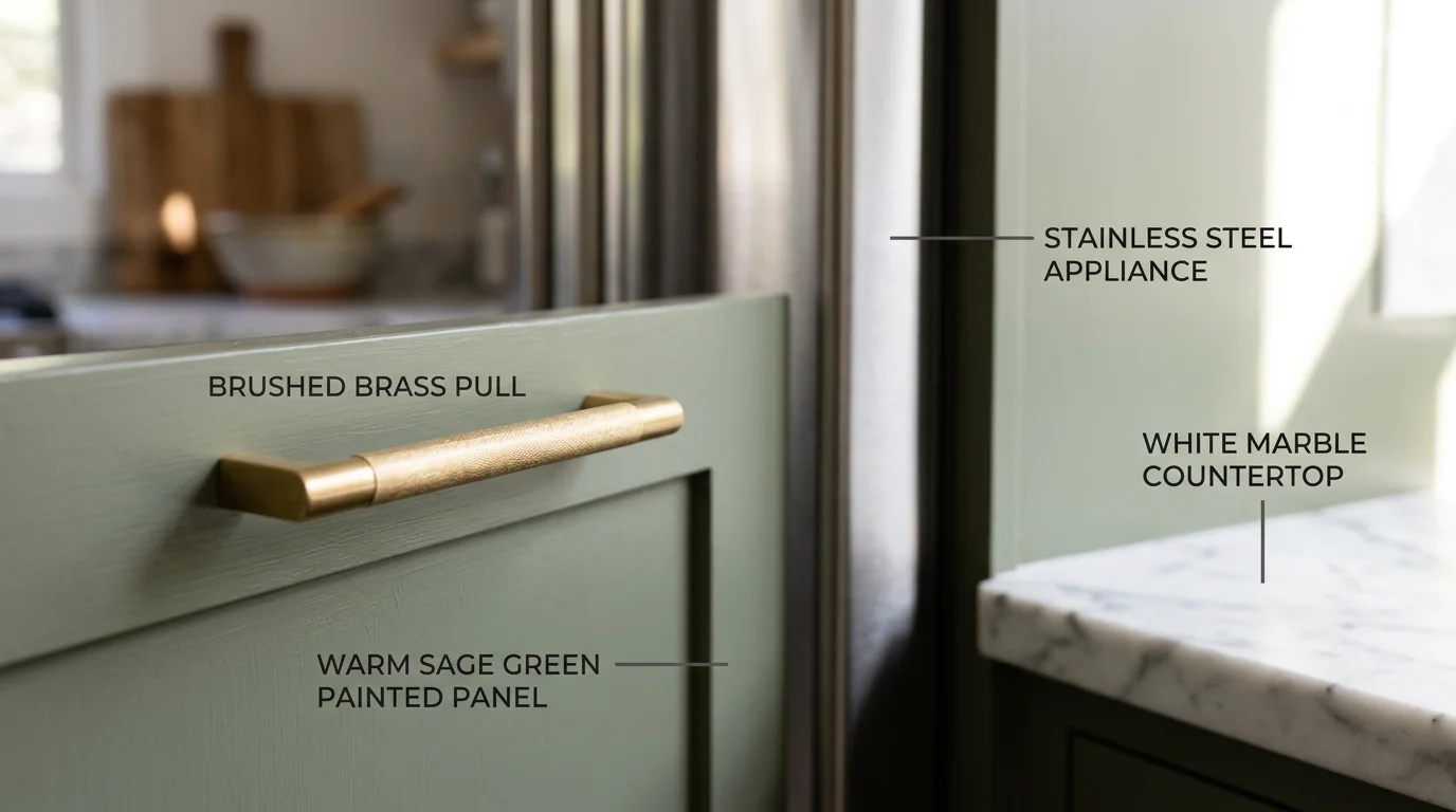
The hardware and fixtures you select act as the jewelry of your kitchen—they either elevate your light green cabinetry or inadvertently clash with it. The finish of your cabinet pulls, knobs, faucet, and lighting directly influences how sophisticated or disjointed your overall design feels. Since light green exists across a spectrum of undertones, not every metallic finish pairs equally well with every shade. Understanding these relationships ensures your hardware enhances rather than competes with your cabinet color.
| Hardware Finish | Best Light Green Matches | Why It Works | Design Style |
|---|---|---|---|
| Brushed Brass / Warm Gold | Yellow-green, sage, soft moss | Warm undertones in brass harmonize with golden or warm green bases; creates inviting, organic feel | Traditional, transitional, farmhouse |
| Polished Chrome / Stainless Steel | Cool gray-green, mint, seafoam | Crisp metallic brightness complements cool undertones without competing; maintains contemporary edge | Modern, minimalist, industrial |
| Matte Black | Any light green (especially cool varieties) | Provides neutral contrast that grounds the palette; prevents light green from feeling too soft or ethereal | Contemporary, farmhouse, eclectic |
| Brushed Nickel | Balanced greens, gray-green blends | Soft metallic tone sits between warm and cool; works as a compromise finish across most light green varieties | Transitional, modern farmhouse |
Your faucet finish deserves particular attention since it's one of the most visible fixtures in the kitchen. Brass fixtures, whether polished or brushed, work beautifully with light greens that lean toward yellow or warm undertones—think sage green or soft chartreuse. The warmth of brass creates a cohesive conversation between the cabinet color and the fixture without requiring stark contrast. Conversely, if your light green cabinet color skews cooler with gray or blue undertones, a polished chrome or stainless steel faucet maintains that crisp, airy aesthetic. Matte black faucets serve as a grounding element regardless of your green's undertone, making them the most forgiving choice if you're uncertain.
Cabinet hardware operates similarly but allows for slightly more personality. Many designers recommend selecting hardware in the same finish family as your faucet to create visual continuity, though intentional contrast can work when executed deliberately. Brushed brass knobs paired with a stainless steel faucet, for instance, creates an intentional mixed-metal aesthetic that feels curated rather than accidental—provided the proportions and placement feel confident.
Lighting fixtures complete the equation. Pendant lights above an island or sink should echo your hardware finish when possible. Warm brass pendants amplify the welcoming quality of warm-toned light greens, while chrome or nickel fixtures maintain the clean, contemporary feel of cooler greens. Consider how your kitchen's natural light interacts with these finishes too. North-facing kitchens with cooler daylight benefit from warmer hardware finishes that compensate for the cool light, while south-facing spaces with warm afternoon sun can handle cooler metallics without feeling cold.
When planning your kitchen remodel with WAREMODEL's innovative design approach, sample your selected hardware finishes directly against your light green cabinet samples under your actual kitchen lighting. A brushed brass pull that looked perfect in the showroom may read differently once installed. This real-world validation prevents the frustration of discovering your hardware choice clashes after installation is complete.
Preparation and Application Tips for Light Green Kitchen Cabinet Paint
Transforming your kitchen with light green cabinets requires more than selecting the perfect shade—the preparation and application process determines whether your investment maintains its beauty for years or deteriorates within months. The foundation of any successful cabinet painting project lies in meticulous surface preparation, thoughtful decisions about professional versus DIY execution, and selecting finishes specifically engineered for kitchen environments.
Prerequisites and Planning
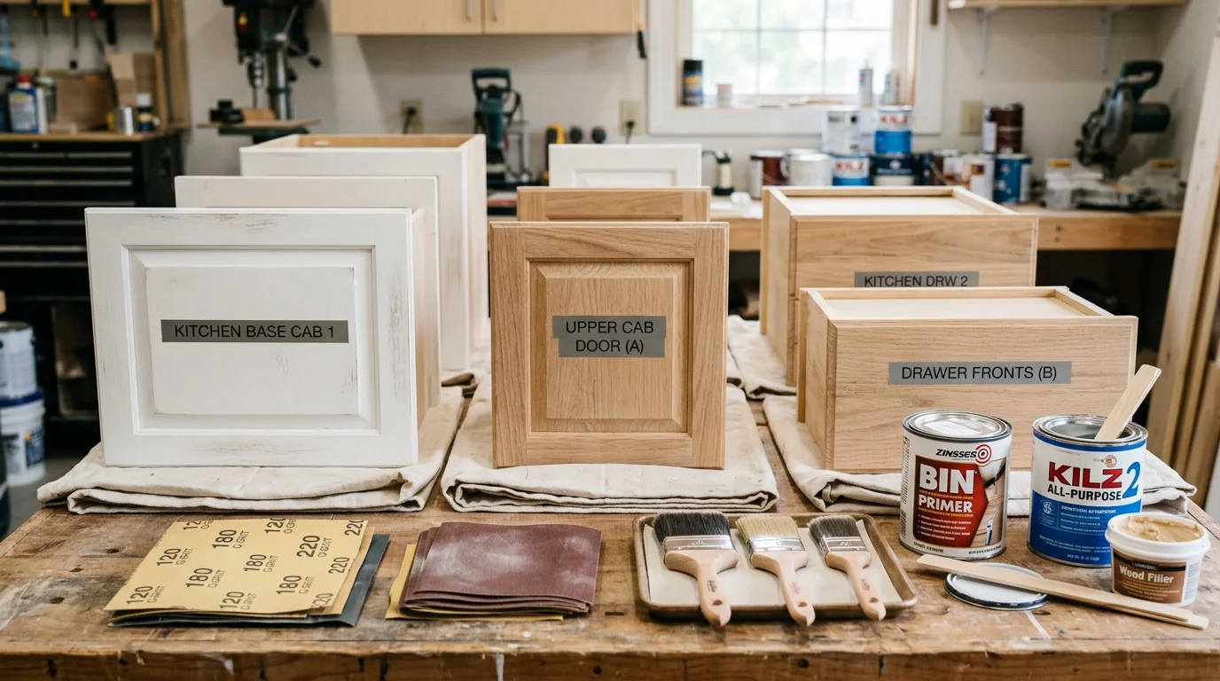
Before any paint touches your cabinets, gather the essential tools and materials. You'll need sandpaper (120, 150, and 220-grit), a degreaser or TSP (trisodium phosphate), drop cloths, painter's tape, quality brushes and foam rollers, primer designed for cabinets, cabinet-specific paint, and safety equipment including gloves and a respirator. Clear your kitchen schedule—professional painters typically complete cabinet painting projects in 3 to 5 days, while DIY projects often stretch over multiple weekends due to drying times between coats.
Step-by-Step Cabinet Preparation Process
Step 1: Empty and Document Your Cabinets
Remove all contents and hardware from your cabinets. Take photos of your cabinet layout before disassembling doors and drawer fronts. Label each piece on the back with masking tape so reassembly becomes straightforward. This documentation prevents confusion when reinstalling hardware and ensures doors align properly.
Step 2: Degrease All Surfaces
Kitchen cabinets accumulate grease, cooking residue, and dust that prevent paint adhesion. Mix a degreaser solution and scrub every surface—doors, frames, and drawer fronts. Pay special attention to areas near the stove. Rinse thoroughly and allow complete drying. This step cannot be rushed; inadequate degreasing causes paint failure within months.
Step 3: Sand the Cabinet Surfaces
Light sanding removes the existing finish and creates tooth for primer adhesion. Begin with 120-grit sandpaper for cabinets with glossy finishes, then progress to 150-grit and finish with 220-grit for smoothness. Sand in the direction of the wood grain when possible. This creates a dull, matte surface that paint clings to effectively. Vacuum and tack-cloth all dust away.
Step 4: Repair Damage and Apply Primer
Fill any dents or gouges with wood filler, sand smooth once dry, and apply a cabinet-specific primer. Cabinet primers differ from standard primers—they're formulated to adhere to glossy surfaces and provide superior blocking of stains and tannins. Apply primer in thin, even coats rather than one thick coat. Allow full cure time (typically 24 hours) before painting.
Step 5: Apply Cabinet Paint in Thin Coats
Cabinet-specific paints like Sherwin Williams Emerald Urethane Trim Enamel and Benjamin Moore Advance create harder, more durable finishes than standard interior paints. These professional-grade products withstand daily kitchen wear far better than commodity paints. Apply 2-3 thin coats rather than one heavy coat, sanding lightly between coats with 220-grit paper. Thin coats dry more evenly and produce superior finish quality.
Choosing Your Finish: Matte, Satin, or Semi-Gloss
The finish you select dramatically affects both appearance and maintenance. Matte finishes hide imperfections beautifully but require frequent cleaning and show fingerprints readily. Satin finishes represent the optimal balance for kitchens—they hide minor flaws while remaining wipeable and practical for daily use. Semi-gloss and gloss finishes create shine that makes kitchens appear larger and resists staining effectively, though they highlight every dust particle and application imperfection, demanding flawless application technique.
Professional Application vs. DIY Execution
The decision between hiring professionals and handling the project yourself hinges on budget, timeline, and quality expectations. Professional cabinet painting costs range from $2,000 to $6,500 total, or roughly $30 to $70 per linear foot, depending on kitchen size and cabinet complexity. Approximately 70 to 80% of professional costs represent labor rather than materials. DIY projects cost $200 to $600 for materials and supplies, offering significant savings but requiring substantial time investment and technical skill.
Professionally painted kitchen cabinets typically last 8 to 15 years before requiring refreshing, while DIY painted cabinets may last 3 to 7 years depending on paint quality and preparation thoroughness. When planning your kitchen remodel with WAREMODEL's innovative design approach, consider that shortcuts in preparation and application create visible problems—peeling paint, uneven finish, and color inconsistencies—that become apparent within months rather than years.
Timeline Expectations and Drying Protocols
Cabinet painting demands patience. After final coat application, allow 24-48 hours before light use and 7 days before full kitchen operation. Humidity, temperature, and paint type influence actual drying times. Cabinet-specific urethane enamels cure more slowly than acrylics but produce superior hardness. Resist the temptation to reinstall hardware or return dishes to cabinets prematurely—premature use causes sticky surfaces and marred finishes that cannot be corrected without repainting.
Common Mistakes to Avoid When Choosing Light Green for Kitchens
Selecting the ideal light green for kitchen cabinets requires more than aesthetic preference—it demands careful consideration of lighting conditions, spatial relationships, and color interactions. Most homeowners encounter predictable pitfalls that undermine their kitchen color selection, often discovering problems only after paint application or cabinet installation. Understanding these mistakes before committing to your design saves both time and expense.
Testing colors exclusively under artificial showroom lighting ranks among the most consequential errors. Paint chips and cabinet samples appear dramatically different under fluorescent store lighting versus natural daylight streaming through your kitchen windows. A pale sage that seemed sophisticated in the showroom can transform into something washed-out or unexpectedly blue-toned when morning light hits your cabinets. Always request sample boards or paint swatches and observe them throughout your kitchen at different times of day—early morning, midday, and evening—before finalizing your decision. This real-world assessment prevents the shock of discovering your chosen shade doesn't match your actual lighting conditions.
Selecting light green undertones that clash with existing fixtures and finishes creates visual discord that no amount of styling corrects. If your kitchen already features warm brass or gold hardware, choosing a cool-toned, blue-leaning light green introduces competing color temperatures that feel disjointed. Conversely, pairing warm, yellow-undertone light greens with stainless steel appliances creates an awkward aesthetic tension. Map your existing finishes—appliance colors, hardware tones, countertop undertones—and ensure your light green complements rather than conflicts with them. This foundational alignment prevents the need for expensive fixture replacements later.
Choosing light green shades too similar to your wall color erases the visual distinction that makes kitchen cabinetry shine as a design anchor. When cabinets and walls occupy nearly identical color territory, the kitchen loses definition and appears flat. Your light green cabinets should create enough contrast with surrounding walls to function as a focal point. If you're committed to light green walls, select a distinctly different shade for cabinets—perhaps a deeper, more saturated green, or shift the undertone entirely (warm versus cool) to establish visual separation.
Ignoring the impact of cabinet hardware and fixture finishes leaves your light green selection incomplete. Hardware acts as visual punctuation that either reinforces your color choice or undermines it. Mismatched metal finishes—combining brushed nickel, chrome, and brass across your kitchen—draw attention away from your carefully selected green cabinetry and create visual chaos. Select hardware and fixture finishes that complement your light green's undertone and establish design cohesion. Whether you choose warm gold tones or cool silver finishes should align with your light green's specific character.
Failing to account for how natural light changes seasonally means your kitchen's appearance shifts throughout the year. The soft, diffused light of winter months renders colors differently than the intense, direct summer sun. A light green that feels perfectly balanced in June may appear too muted in December, or conversely, too vibrant when summer light intensifies. Observe your kitchen's lighting patterns across seasons before committing, or plan your color selection around the season when you'll spend the most time in the space.
Overlooking how light green interacts with your kitchen's overall spatial proportions can make the space feel smaller or larger than intended. Lighter greens in compact kitchens can expand the perceived space, while overly saturated or dark greens in small kitchens may feel confining. When planning your remodel with WAREMODEL's innovative design approach, consider how color psychology influences spatial perception alongside your functional layout needs. Your light green choice should support, not compete with, your kitchen's spatial goals.
Frequently Asked Questions About Light Green Kitchen Colors
Will light green cabinets go out of style?
Light green kitchen colors have proven remarkably durable in design trends over the past decade, and current projections suggest they'll remain relevant for years to come. Unlike trendy jewel tones that spike and fade, soft greens tap into a timeless connection to nature that transcends seasonal design cycles. The key is selecting a sophisticated, muted shade rather than a novelty bright green—sage, pistachio, and celadon tones age gracefully in kitchens because they feel inherently balanced. Your light green choice will outlast fads if it complements your home's architecture and your personal aesthetic rather than chasing what's currently viral on design platforms.
What's the difference between sage green and pigeon green?
Sage green carries warm, earthy undertones with gray muting that creates a sophisticated, somewhat muted appearance—think dried herbs and natural linen. Pigeon green, conversely, leans cooler with subtle blue undertones, producing a more refined, almost dusty aesthetic that feels contemporary without being cold. Both are excellent choices for kitchen cabinets, but sage works beautifully in traditionally styled kitchens with warm wood tones, while pigeon green pairs exceptionally well with modern minimalist designs and cool-toned metals. The undertone difference means these colors will interact differently with your lighting, so observe paint samples in your kitchen at various times of day before deciding.
Can I use light green on an island only?
Absolutely—an island painted in light green while surrounding cabinets remain neutral (white, cream, or natural wood) creates a striking focal point without overwhelming the space. This approach works particularly well in open-concept kitchens where the island serves as a visual anchor. The contrast draws the eye and adds personality while maintaining overall balance. However, ensure your light green island coordinates with your countertop, backsplash, and wall colors; isolation doesn't mean the color exists in a vacuum. When planning a strategic remodel like this with WAREMODEL's innovative design approach, consider how the island's color will interact with your kitchen's traffic flow and sightlines from adjacent living areas.
How do I lighten a green that's too dark?
If your light green kitchen cabinets appeared darker than expected after application, you have several remedies. First, ensure your lighting is adequate—adding under-cabinet or overhead lights can dramatically shift how the color reads. Second, introduce lighter accent colors through hardware, backsplash, or wall paint to visually "lift" the cabinets. Third, apply a lighter topcoat or glaze if the paint is still wet or freshly cured, though this requires professional technique. Finally, if the color is truly unsuitable, a repaint with a lighter green shade is sometimes the most practical solution—better to invest in correction early than live with regret for years.
What's the best light green for small kitchens?
For compact kitchens, the most effective light green shades are those with significant white or gray undertones—these maximize the perception of space and airiness. Pistachio greens with substantial white content, celadon with cool gray tones, and soft sage-white blends all work beautifully in smaller footprints. Pair your light green with white or very light walls and adequate lighting to amplify the spatial expansion. Avoid saturated or darker greens in tight kitchens, as they can make the space feel enclosed. The psychological effect of lighter, cooler greens on spatial perception is well-documented in kitchen design—they genuinely make compact kitchens feel larger than they are.
Should light green cabinets have a matte or glossy finish?
Matte and satin finishes enhance the natural, sophisticated quality of light green, allowing the color's complexity to shine without reflective glare. Glossy finishes work too, but they can make light green appear slightly artificial or plastic-like, especially in brighter kitchens. Satin offers the best compromise—it provides easy cleaning and subtle sheen without the formal appearance of full gloss. Your choice should align with your kitchen's overall aesthetic: modern minimalist kitchens often favor satin, while farmhouse or transitional styles benefit from matte's understated elegance. Consider your kitchen's lighting and how reflections will interact with adjacent surfaces when making this decision.
How do light green kitchen colors work with stainless steel appliances?
Light green and stainless steel create a refreshingly modern pairing that feels both contemporary and natural. The cool undertones in many light greens complement steel's metallic neutrality without competing for visual attention. This combination works particularly well in kitchens emphasizing clean lines and minimalist design. However, ensure your green isn't so cool-toned that it clashes with warmer stainless finishes—some steel appliances have warmer bronze or champagne undertones that pair better with greens containing subtle warm notes. If you're upgrading appliances alongside your cabinet remodel, view them as complementary choices rather than afterthoughts, ensuring both elements support your overall color strategy.
Can I combine light green with other cabinet colors in the same kitchen?
Yes, two-tone cabinetry is an increasingly popular design strategy that works beautifully when light green is one of your colors. Pairing light green lower cabinets with white or cream uppers creates visual interest while maintaining sophistication. Alternatively, use light green on perimeter cabinets and a contrasting neutral on the island for balanced emphasis. The key is ensuring both colors share similar undertone families—mixing warm sage with cool whites can feel disjointed, while pairing warm sage with warm cream creates cohesion. This layered approach adds depth to your kitchen's design without the commitment of an all-over green palette.
Creating Your Perfect Light Green Kitchen Through Thoughtful Color Selection
Selecting the ideal light green for your kitchen remodel demands more than browsing paint swatches—it requires a deliberate framework that honors both your aesthetic vision and the practical realities of your space. Throughout this guide, you've explored how undertones shift under different lighting, how specific brands deliver consistent quality, and how hardware and surrounding colors either amplify or undermine your chosen palette. The final step is synthesizing this knowledge into a coherent decision-making process that feels confident rather than overwhelming.
Begin by committing to natural light assessment as your anchor point. Spend several days observing how sunlight moves through your kitchen at different times, noting whether your space leans warm or cool. Purchase sample pots of your top two or three light green contenders and apply them to large poster board or directly onto cabinet sections if possible. Live with these samples for at least a week, viewing them in morning light, afternoon brightness, and evening conditions. This investment in time pays dividends by eliminating the regret that comes from discovering your chosen green feels muddy at 6 PM or too blue-toned at noon.
Next, coordinate your light green selection with existing elements you're keeping—countertops, appliances, flooring, and backsplash materials. If you're working with warm-toned wood or golden granite, gravitate toward sage greens with subtle warm undertones rather than cool, minty varieties. Conversely, cool gray countertops and stainless steel appliances harmonize beautifully with crisp, cool-leaning light greens. This alignment creates visual cohesion that makes your entire kitchen feel intentional rather than assembled from disconnected pieces.
Quality matters profoundly in kitchen environments where cabinets endure daily use, moisture, and temperature fluctuations. Premium paint formulations from established brands resist chipping, maintain color integrity over time, and provide superior coverage, ultimately protecting your investment. The cost difference between budget and mid-to-premium tier paints is negligible compared to the expense of a full cabinet remodel, making durability a non-negotiable priority.
If you're undertaking a comprehensive kitchen remodel, consider partnering with professionals who understand how color selection integrates with spatial planning and workflow optimization. At WAREMODEL, our innovative remodeling approach ensures that your color choices work in concert with functional design, creating kitchens that are as practical as they are beautiful. Whether you're refreshing cabinets alone or reimagining your entire kitchen layout, thoughtful consultation helps you avoid costly missteps and maximizes the impact of your investment.
Light green remains a timeless choice precisely because it adapts to evolving tastes while delivering immediate warmth and sophistication. Take your time with selection, trust your instincts informed by careful observation, and don't hesitate to seek expert guidance when uncertainty arises. Your kitchen deserves a color that brings you genuine joy every time you enter it.